0

Jamie Reid: The Sex Pistols Artist Who Vandalized the Queen

Share
One torn-up photo of the Queen, a pile of cut-out newspaper letters and a glue stick. That's how Jamie Reid handed punk its face and rattled the British establishment in the process.

In the summer of 1977 a torn-up portrait of Queen Elizabeth II turned up on a 7-inch sleeve, her eyes and mouth blanked out with cut-out letters. The man behind it was Jamie Reid, the graphic designer whose Sex Pistols artwork shaped the look of punk more than any studded jacket ever did. He worked in scissors, glue and stolen newspaper type, building a visual language the genre still leans on.

Reid lived from 1947 to 2023 and crammed a lot into the gaps around punk: a radical newspaper, decades of protest art and a quiet streak of Druid mysticism. Here’s how a Croydon art-school kid built the grammar of punk, plus where his work wandered once the Pistols flamed out.

A Croydon Kid With Two Inheritances

Jamie Reid arrived in London on 16 January 1947 and grew up in suburban Croydon, raised in a home where socialist politics sat alongside Druid spiritual traditions. He passed through John Ruskin Grammar School, started at Wimbledon Art School in 1962 then landed at Croydon Art School in 1964. That stretch of art school is where the whole story turns, since it’s where he met a fellow student named Malcolm McLaren. The pair ended up running a campus sit-in together, an early hint of the art-meets-agitation streak that ran through Reid’s career. Picture a kid soaking up Situationist theory between life-drawing sessions, already eyeing the establishment as a target.

1970: Suburban Press and the Ransom-Note Trick

Suburban Press spread by Jamie Reid showing a black and white supermarket photomontage captioned Panic buying and You wouldn't know we were a supermarket, with a red Last Days Official Warning Closing Down Sale sticker pasted across the centre

Suburban Press, Last Days Sticker

In 1970 Reid co-founded Suburban Press, a scrappy left-wing community paper in south London that he kept alive for around five years. It chased housing scandals, local corruption and shady property deals, with graphics that looked photocopied on a tight deadline. This was the lab where his signature move got invented. Strapped for cash and time, Reid started snipping letters out of newspaper headlines and gluing them back into slogans that read like kidnap notes. Cheap, crooked and faintly menacing. That homemade look of misaligned type and torn edges walked straight off the Suburban Press paste-up table onto the most talked-about record covers of the decade.
Suburban Press No 1 cover designed by Jamie Reid, high-contrast halftone photo of a suburban semi-detached house with an estate agent listing reading Fresh From the Suburbs

Suburban Press, No. 1

Suburban Press No 5 cover designed by Jamie Reid, red and white print of the Croydon flyover and tower blocks with the handwritten slogan Lo A Monster Is Born

Suburban Press, No. 5

1976: McLaren Comes Knocking

Anarchy in the U.K. promotional artwork by Jamie Reid for the Sex Pistols, a torn Union Jack reassembled with safety pins and bulldog clips, with the band name and song title in ransom-note lettering and the line First Single EMI 2566

Sex Pistols, Anarchy in the U.K. promo, 1976

By 1976 McLaren was managing a brand-new band called the Sex Pistols, and he wanted the Suburban Press attitude on their records. Reid’s first job set the rulebook for everything that followed. He took a cheap souvenir Union Jack, ripped it up then clamped it back together with safety pins and bulldog clips, the band name and title torn from headlines in classic ransom-note style. This torn-flag image ran as the EMI promo art for the single, since the actual 7-inch shipped in a plain black sleeve. One look and you already knew what the band sounded like.

1977: The Rest of the Run

The singles kept coming through 1977, and Reid gave each one its own piece of trouble.
Pretty Vacant front sleeve by Jamie Reid for the Sex Pistols, an ornate gilt picture frame around a pane of smashed glass over a hessian sunburst, with ransom-note strips reading Sex Pistols and pretty vacant

Sex Pistols, Pretty Vacant, 1977 - Front

Pretty Vacant back sleeve by Jamie Reid for the Sex Pistols, two buses head to head in white on black with destination boards reading Nowhere and Boredom, and ransom-note text listing pretty vacant and No Fun with the Sex Pistols name, Virgin Records

Sex Pistols, Pretty Vacant, 1977 - Back

Reid kept the collage energy going with two clapped-out buses, their destination boards reading Nowhere and Boredom. The gag is dry as a bone and lands instantly, which is the whole appeal. The image has a contested backstory, with a San Francisco situationist group claiming an earlier version, so it sits in punk’s long habit of borrowing and repurposing. Cheap, funny and a little bleak.

Holidays in the Sun front sleeve by Jamie Reid for the Sex Pistols, a parody travel brochure built from cartoon comic-strip panels with speech bubbles carrying the song lyrics, a sunburst logo and the Sex Pistols name in ransom-note letters, Virgin Records VS191

Sex Pistols, Holidays in the Sun, 1977 - Front

Holidays in the Sun back sleeve by Jamie Reid for the Sex Pistols, a torn travel-magazine photo of a family dining scene tagged with sarcastic NICE labels reading nice image, nice people and nice young man, with a SATELLITE block and the 1977 Glitterbest credit

Sex Pistols, Holidays in the Sun, 1977 - Back

For this one Reid hijacked a Belgian travel brochure, the kind of sunny cartoon strip you would grab in a travel agent’s window. He kept the happy holiday artwork then swapped the speech bubbles for lines from the song, so a cheerful package-tour advert came out sneering. The Belgian travel company was not amused and sued for copyright, which forced a plain re-issue. Détournement in its cheekiest form.

Never Mind the Bollocks front cover by Jamie Reid for the Sex Pistols, an acid yellow sleeve with the title in heavy black type and the band name in yellow cut-out letters across a hot pink banner

Sex Pistols, Never Mind the Bollocks, 1977 - Front

Never Mind the Bollocks back cover by Jamie Reid for the Sex Pistols, a hot pink sleeve scattered with the track titles in yellow and black ransom-note lettering including Anarchy in the U.K., God Save the Queen, Pretty Vacant, Bodies and Holidays in the Sun

Sex Pistols, Never Mind the Bollocks, 1977 - Back

The only studio album threw subtlety out the window with acid yellow and hot pink, the title stacked in cut-out ransom-note letters across the front. Reid skipped the band photo entirely and let blunt typography do all the shouting. It looks like a fly-poster slapped on a wall at 2am, which is precisely the point. Forty-odd years on it still reads as loud.

1977: The Queen Gets the Scissors

God Save the Queen artwork by Jamie Reid for the Sex Pistols, a halftone portrait of Queen Elizabeth II in an oval with her eyes and mouth covered by ransom-note strips reading God Save the Queen and Sex Pistols, set over a real Union Jack flag

Sex Pistols, God Save the Queen, 1977

The single best-known image Reid ever made arrived in 1977 with “God Save the Queen”. He took a Silver Jubilee portrait of Queen Elizabeth II by photographer Peter Grugeon, then blanked out her eyes and mouth with ransom-note strips reading the band name and title. It went out in two forms, a version screenprinted straight over a Union Jack and a solid blue record sleeve.

God Save the Queen blue VS181 sleeve front by Jamie Reid for the Sex Pistols, a halftone portrait of Queen Elizabeth II in an oval printed silver on deep blue, her eyes and mouth covered by ransom-note strips reading God Save the Queen and Sex Pistols

Sex Pistols, God Save the Queen, 1977 - Front

God Save the Queen blue VS181 sleeve back by Jamie Reid for the Sex Pistols, a deep blue sleeve with ransom-note track listing reading God Save the Queen and Did You No Wrong, the Sex Pistols name, the catalogue number VS 181 and a 1977 Virgin Records credit

Sex Pistols, God Save the Queen, 1977 - Back

The timing was the gut-punch. It dropped during the Queen’s Silver Jubilee, with bunting hanging from every lamppost. Pressing-plant staff refused to handle it, the shops kept it off the shelves and the BBC banned the song outright. In 2011 Q magazine called the sleeve the greatest record cover ever made.

How Jamie Reid's Cut-and-Paste Look Worked

Call It Filthy Lucre, 1976, a ransom-note collage by Jamie Reid with cut-out printed letters spelling call it filthy lucre we call it fucking great, pasted over rough black marker scribbles on aged paper

Jamie Reid, Call It Filthy Lucre, 1976

Strip away the shock value and Reid’s method is pretty consistent. He worked in collage and décollage: torn posters layered over each other, headlines sliced into ransom-note slogans, familiar images roughed up with paint, tape and pins. The ransom-note type was the key, since it borrowed the visual grammar of kidnap and threat then aimed it at the monarchy, the police and consumer culture. He leaned on the Situationist idea of détournement, hijacking flags, banknotes and royal portraits to flip their meaning. Everything looked like it could have been knocked together on a kitchen table with scissors and a glue stick, misregistered colors and visible tape included. That deliberate roughness was the whole point.

After Punk: Art for the Picket Line

Free Pussy Riot, 2012, a collage by Jamie Reid showing a blue knitted balaclava with eyes and mouth cut out to reveal a face, surrounded by ransom-note and stencil text reading Free Pussy Riot and Putin says he's seen the light and he sold his soul for punk, with a Putin label across the forehead

Jamie Reid, Free Pussy Riot, 2012

Fuck Your Wars, a screenprint collage by Jamie Reid showing a dark balaclava on a lime green background with cut-out letters reading Fuck Your Wars, a Peace Is Tough block in the lower corner, a Putin label and the artist's signature with an anarchy symbol

Jamie Reid, Fuck Your Wars, 2022

The Pistols made Reid famous, and he spent the following decades pointing the same tools at real political fights. His posters, banners and collages backed campaigns against the Poll Tax, Clause 28, the Criminal Justice Bill and the 2008 banking crisis, along with protests tied to English Heritage and colonialism. Younger movements picked up his imagery too, from Occupy London to Extinction Rebellion to Free Pussy Riot, and he worked directly with activists linked to Pussy Riot. Shows like Taking Liberties! and Casting Seeds gathered this side of his output, stacking up years of posters, stickers and installations built to grab a crowd by the collar. The man never really stopped agitating.

The Esoteric Side: Druids and the Eight Fold Year

When the Earth Had Many Moons, 1990, a print by Jamie Reid showing several moons in orange, gold and deep blue hanging in a textured night sky above the silhouettes of a standing stone circle

Jamie Reid, When the Earth Had Many Moons, 1990

Here’s the part most people miss. Reid grew up around British Druid orders, with relatives like George Watson MacGregor Reid holding leadership roles in the movement early in the twentieth century. He described his practice as having an esoteric side and a political side, and tied his hope for spiritual change to his push for social change. In later years he dug into Celtic myth, pagan symbols and the Druidic ritual calendar, painting banners and hangings full of mystical and astrological motifs. His book Eight Fold Year, issued as loose leaves then bound in 2017, collects paintings, photos and texts on the eight festivals of the Druid year, with essays from Druid chief Philip Carr-Gomm.

Strongroom, Liverpool and the Final Chapters

Control room at Strongroom Studios in London decorated by Jamie Reid, a large mixing console facing walls and ceiling covered in his murals of colourful star and compass mandalas, sacred-geometry roundels and symbolic motifs in purple, orange and gold

Jamie Reid's murals at Strongroom Studios, London

From the late 1980s onward Reid spent about a decade turning London’s Strongroom Studios into an immersive space of murals, hangings and installations, even folding in aromatherapists and acupuncturists as a jab at dreary office design. That work led to a long collaboration with Afro Celt Sound System, who got their visual identity and album art from him. For roughly his last twenty years he was based in Liverpool, where he staged Casting Seeds at The Florrie in 2016 to 2017, complete with a Sex Pistols mural, a tipi and seed cards handed out around the neighborhood. He died on 8 August 2023, aged 76, with work held by Tate Modern and MoMA.

Why He Still Matters

Jamie Reid’s look got copied so hard it almost turned into wallpaper: the safety pins, the torn flag, the headline-scrap type now read as shorthand for rebellion on everything from festival flyers to fast-fashion tees. The original work carried real teeth, aimed at monarchy, nationalism and the music business at a moment when that aim still drew blood. For designers, his lesson holds up: cheap tools and a clear target can outlast a thousand polished campaigns.

If you feel like making something in Reid’s cut-and-paste spirit, we put together a few packs for exactly that. Start with the raw materials: Ransom Note Letters gives you 2150+ real magazine letters, hand-cut and scanned at high res, while Word Clippings adds 1250+ vintage words pulled straight from old magazines and headlines. Between the two, you have plenty to cut, rearrange, deface and turn into messages of your own.

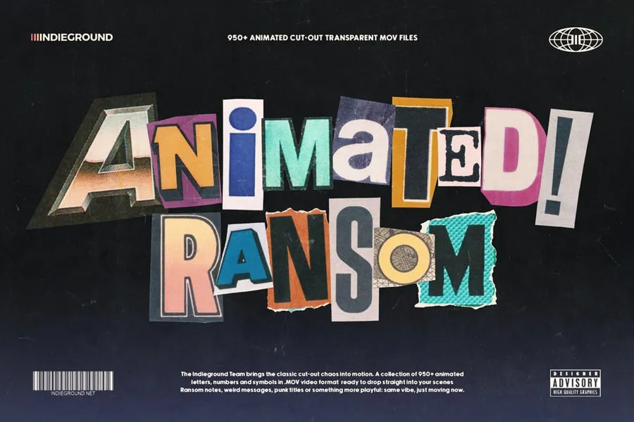
And you don’t have to stop at words. Take the same ransom-note typography into motion with Animated Ransom Note Letters, or build out the rest of the composition with Collage Elements, packed with retro cutouts ranging from body parts and flowers to planets, food, vehicles and landscapes. Mix everything together and you’ve got a pretty convincing recipe for posters, collages, videos and all kinds of beautifully unruly experiments.
Keep reading for more Inspiration!

We hope you enjoyed the story of Jamie Reid, the iconoclast who handed British punk its face with scissors, glue and cut-up newspaper type. If you want to go deeper, you can browse the John Marchant Gallery archive that looks after his estate, or track down his work in major collections like Tate Modern, MoMA and the National Portrait Gallery.
And if you, like us, are a fan of everything retro, have a look at our articles that explore the artists and stories behind the Eighties and Nineties: the scenes, the posters and the design moves that still spark ideas today.

Picture of Indieground Design

Indieground Design

We are a team of designers, developers & photographers from Italy and we love to create striking graphic resources! Have a look around our website to discover more about what we do and the services we offer!

Picture of Indieground Design

Indieground Design

We are a team of designers, developers & photographers from Italy and we love to create striking graphic resources! Have a look around our website to discover more about what we do and the services we offer!

Popular Articles
From the Shop
Check our premium products
Other Creative Stories
Wanna See More?
We have an entire archive of articles about graphic design, pop culture and 80s and 90s aesthetics. Check it out!